Church / local community • Holt, Michigan • website launch + local visibility support
How Holt Assembly went from no website to a church site that supports local discovery
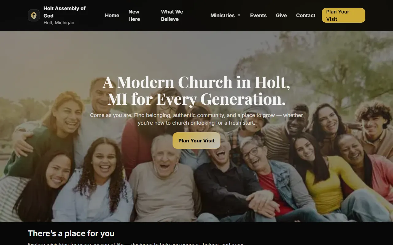
This project gave Holt Assembly of God its first real website, created a clearer path for first-time visitors, and helped the church become easier to find through stronger local signals, clearer service information, and a more complete Google Maps-ready presence in Holt, Michigan.
Want the bigger picture too? Review the web design service details or compare this project against the rest of the portfolio.
The challenge
Before launch, the church had no real digital front door for visitors or local search.
The problem was not that the church needed prettier design. It needed a public presence people could actually find, trust, and use before showing up on a Sunday morning.
What was missing before launch
- There was no existing website to explain who the church was, where it met, or when service started.
- People searching for churches in Holt had little reason to trust what they found or know what to expect before visiting.
- There was no simple first-visit path covering parking, kids, service length, or contact details.
- Ministry information and next steps for different age groups were not clearly surfaced online.
- Local discovery signals were too thin to support a stronger Google Maps presence.
What the launch needed to do
- Give Holt Assembly a clear, modern, mobile-friendly public website from scratch.
- Make service time, address, directions, and contact details obvious within seconds.
- Reduce first-visit uncertainty with practical guidance instead of vague church language.
- Create clearer ministry pathways so families, youth, and young adults could self-route faster.
- Support stronger local visibility with better location consistency, Maps links, and entity clarity.
The approach
The build focused on making the church easier to find, easier to understand, and easier to visit.
Instead of treating the website like a decorative brochure, the launch was built around practical church discovery: location trust, first-visit clarity, ministry navigation, and the kind of public-facing information Google and real visitors both rely on.
1
Local entity foundation
The site established consistent public information around Holt, Michigan, including address, service time, directions, and church identity signals.
2
First-visit UX
Plan-a-visit and new-here paths reduced uncertainty by answering the real questions newcomers usually have before attending.
3
Trust-building content
Pastor visibility, building photography, reviews, and practical expectation-setting made the church feel more welcoming and more credible online.
4
Mobile-first usefulness
The most important actions—directions, service info, contact, and visit planning—were made easier to reach from smaller screens.
Before launch / after launch
This was not a redesign. It was the creation of a usable public presence.
The proof is less about visual makeover drama and more about what became possible after launch: people could finally find the church, understand it, and take the next step with confidence.
Before launch
No clear digital path
- No website to explain the church
- No visit-planning flow
- No ministry routing online
- Weak support for local Maps visibility
After launch
A real first-visit system
- Live homepage and local trust signals
- New Here + Plan Your Visit guidance
- Ministry pathways by life stage
- Address, directions, and contact clarity
Strategic comparison
What changed, beyond simply having a homepage
Each shift below improved either local discovery, visitor confidence, or the clarity of what a first-time guest should do next.
Search presence
From weak local visibility to a clearer public entity
Before: no real website to reinforce who the church was or where it met. After: a live site connected church identity, address, service time, and directions in one clearer system.
Homepage messaging
From no message at all to a welcome-first introduction
The new homepage introduces the church with a clear promise, visible visitor CTAs, and a simpler explanation of who the church is for.
Visitor guidance
From uncertainty to first-visit clarity
Plan-a-visit, service details, parking notes, kids information, and FAQs now help newcomers feel prepared before they attend.
Ministry routing
From invisible pathways to clearer next steps by life stage
Kids, youth, and young adults all gained clearer routes, helping the site serve more than a single generic audience.
Trust signals
From unknown to more human and more believable
Pastor visibility, member reviews, building imagery, and practical expectation-setting gave the church more warmth and credibility online.
Contact + directions
From missing basics to a usable Sunday path
Address, directions, phone, and contact routes are now visible enough to support both Google Maps behavior and real-world attendance decisions.
Key improvements
The launch improved both local discoverability and first-visit readiness
This page focuses on verified structural changes rather than inflated performance claims. If your business or organization is dealing with the same kind of blank-slate visibility problem, this project is a useful proof point.
None → live
The church moved from having no website to a complete, publicly accessible digital presence.
Low → structured
Service time, parking, kids check-in, and what-to-expect guidance now exist in a usable visitor flow.
Thin → visible
Address, Holt location framing, Maps links, and public church identity now reinforce each other.
0 → 4+
The site now routes different audiences into age-appropriate ministry pages instead of leaving them to guess.
Missing → welcoming
Pastor introduction, reviews, imagery, and expectation-setting make the church feel more established online.
Site architecture
The launch created a real path from search to attendance.
The website now gives both search engines and human visitors a more complete picture of the church: what it offers, what to expect, and how to get there.
New visitor pages
- Home
- New Here
- Plan Your Visit
- Contact
Community + ministry pages
- Kids Ministry
- Youth
- Young Adults
- What We Believe
Visitor-confidence upgrades
The website does more than look modern. It lowers uncertainty.
- Homepage messaging now introduces the church with clearer hospitality and stronger local context.
- Pastor Marti Thames is visible as a leadership and trust anchor instead of being absent from the public story.
- Review excerpts and building imagery make the site feel more grounded and more human.
- The content structure is practical: directions, service info, ministry routing, and visitor expectations all appear where people need them.
Outcome
What this launch improved immediately
The site gave Holt Assembly a credible, useful digital presence and helped support stronger local discovery. People can now find the church more easily, understand it more quickly, and take a clearer path from search to visit.
Stronger local presence
The church now has a real website reinforcing its name, address, service time, and Holt identity.
Lower first-visit uncertainty
Newcomers can answer practical questions before they attend instead of relying on guesswork.
Better support for Google Maps discovery
The launch created the kind of public-facing local signals that help a church become easier to find and trust in Maps-driven search behavior.
This page intentionally focuses on verified structural and local-discovery improvements. Additional performance or search metrics can be added later if available.
Best next step
Once this story feels familiar, move to the proof layer that closes the remaining gap
This case study proves the strategic lift. From here, most buyers either want to inspect more finished work, compare other case-study situations, or talk through whether their own organization needs a first-launch build or a trust-first redesign.
Need broader visual proof?
Review the portfolio
Best if you want to compare this church launch against other finished sites and device presentations.
Go to portfolio →Need similar stories?
Browse more case studies
Best if you want to compare this blank-slate launch against contractor or SaaS positioning challenges.
See case-study hub →Need project direction?
Bring your visibility gap to a call
Best if you want help mapping the right launch scope, trust priorities, and audience pathways for your own organization.
Book strategy call →Need this kind of launch?
If your organization is hard to find online or harder to trust than it should be, this is the kind of problem I solve.
Bring your current visibility gap, the audience you need to serve better, and the example above that feels closest to your situation. We can map the right scope without drifting into agency theater.