B2B / SaaS • WordPress plugin launch • Product positioning + pricing architecture
How PureRank SEO launched with a clearer premium product story
This launch turned PureRank SEO into a more complete product-marketing system: a site built to explain a premium WordPress SEO plugin quickly, differentiate against familiar incumbents, organize Free / Pro / Premium buying paths, and make the business-intelligence layer feel like a serious strategic upgrade instead of a bloated add-on tier.
Want the broader context too? Review the web design service details or compare this project against the rest of the portfolio.
The challenge
A premium plugin launch has to explain more than features. It has to explain why this product deserves trust.
PureRank was entering a crowded category full of familiar plugin names, overloaded feature grids, and generic “optimize your SEO” language. The site needed to make the strategic difference obvious fast.
What the launch site needed to solve
- Explain the product as an SEO operating system, not just another WordPress plugin with a score meter.
- Differentiate clearly against Yoast, Rank Math, and AIOSEO without sounding like generic competitor mud-slinging.
- Make the Premium tier feel meaningfully stronger through business-intelligence workflows, not just a longer checklist.
- Support multiple buyer types: small businesses, freelancers, agencies, ecommerce teams, and plugin switchers.
- Create enough trust depth through About, FAQ, docs, legal, and comparison content that buyers could self-educate before installing.
What the site had to communicate immediately
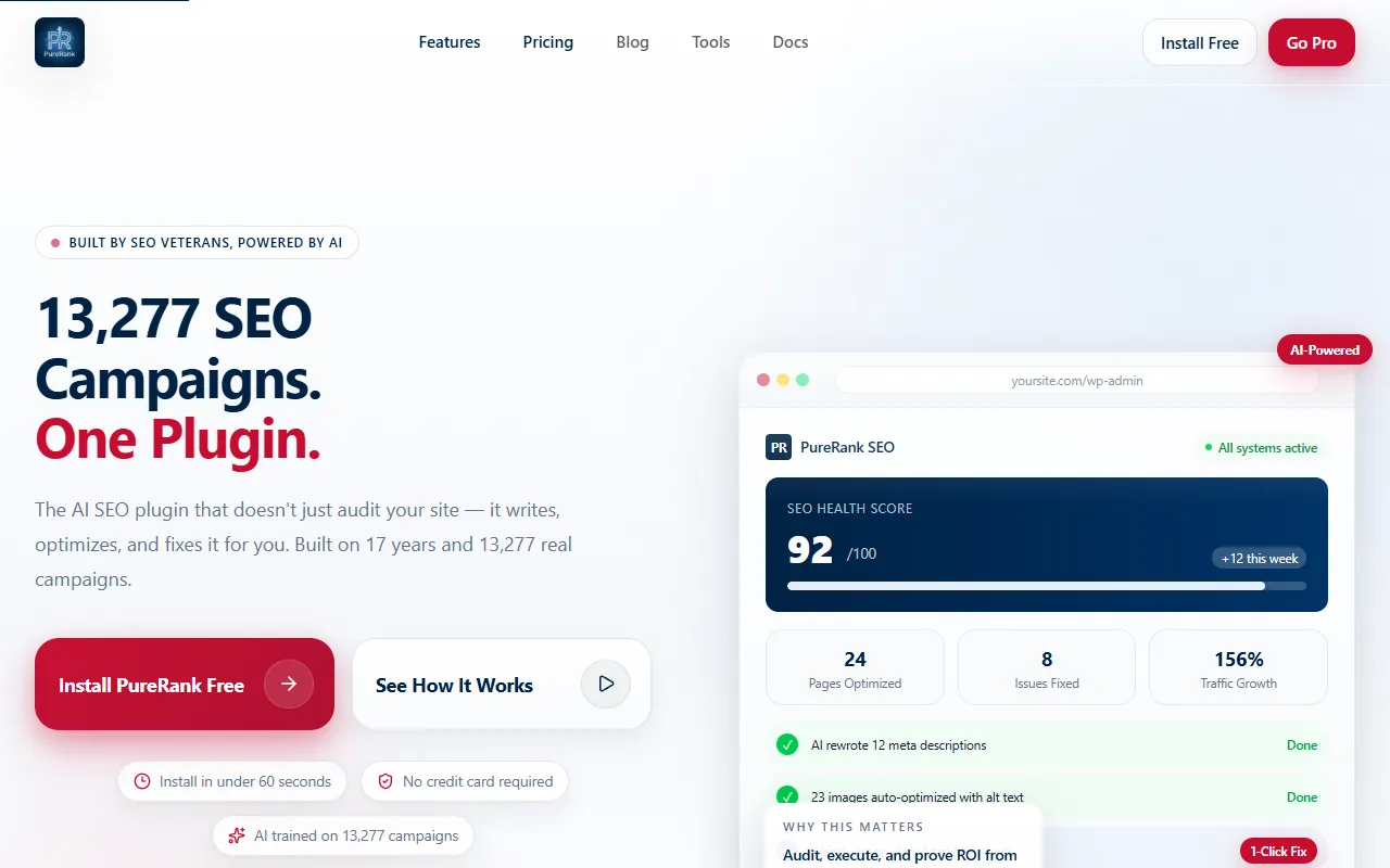
- 17 years of SEO expertise and 13,277 campaigns behind the product logic.
- Three flagship AI workflows that feel tangible, not theoretical.
- A pricing ladder that makes Free, Pro, and Premium feel like deliberate steps rather than a confusing upsell maze.
- A cleaner path for users switching from older plugins who want less complexity and more action.
- A product tone that feels credible, operator-focused, and WordPress-native rather than overproduced SaaS theater.
The approach
The build organizes PureRank around momentum, differentiation, and proof.
Instead of throwing all 33+ features into one noisy wall, the site stages the product through a cleaner narrative: what is broken in the category, what PureRank changes, what the flagship workflows feel like, and how the pricing ladder matches buyer readiness.
1
Category reframing
The homepage positions PureRank as the plugin that writes, optimizes, and fixes—not just one that audits and leaves the work to the user.
2
Premium product moments
AI content writing, image SEO, and the weekly action plan act as experiential anchors that make the premium story feel concrete.
3
Pricing clarity
Free, Pro, and Premium are staged as distinct maturity levels so the buyer can understand the upgrade path without friction.
4
Trust architecture
About, FAQ, compare pages, docs, tools, changelog, and legal policies reinforce that the site is selling a serious product with operational depth behind it.
Site architecture
The launch works because the site supports more than one kind of product conversation.
PureRank is not being sold through a single homepage promise alone. The architecture gives different buyers different ways to validate the product, compare it, and decide whether the next step is Free, Pro, or Premium.
Buyer-confidence pages
- About
- FAQ
- Privacy / refund / terms
- Contact + support
Demand-capture pages
- Compare pages
- Docs
- Blog
- Tools + changelog
Launch proof
The site communicates a lot, but it does not feel structurally lost.
Desktop and mobile both support the same job: establish category clarity quickly, make premium workflows feel visible, and help the user choose an entry point without getting buried in plugin jargon.
Strategic build decisions
What makes this product site feel more intentional than a typical plugin launch page
The stronger moves are structural: what gets highlighted first, how premium is framed, and how the site reduces uncertainty for buyers comparing multiple tools.
Hero positioning
From plugin category noise to operator-friendly clarity
The opening message frames PureRank around action and outcomes: strategy, fixes, and proof—rather than another rules-based plugin promising generic optimization.
Premium story
From checklist inflation to visible product moments
The site sells Premium through vivid workflows like AI content writing, image SEO, and weekly action planning, which gives the upsell real shape.
Competitive differentiation
From vague superiority claims to comparison architecture
Dedicated compare pages and side-by-side matrices give switchers a practical reason to keep reading instead of bouncing back to the incumbent plugin they already know.
Trust depth
From “trust us” to a fuller operating surface
About, FAQ, docs, tools, changelog, refund policy, and privacy language make the product feel supported by a real operating company rather than a thin affiliate-style landing page.
Pricing system
From confusing upsell stack to progressive entry points
The Free / Pro / Premium ladder creates a cleaner buying path: start free, expand into toolkit depth, then move into AI execution and revenue intelligence when the ROI story demands it.
Audience fit
From one-size messaging to multiple buyer paths
The messaging supports small businesses, freelancers, ecommerce teams, agencies, and switchers without collapsing into vague copy that fits no one well.
Build notes
The site feels like a product system, not a one-page launch stunt.
- The homepage uses category explanation and flagship product moments to create early comprehension before the user ever reaches the deeper feature stack.
- The pricing ladder helps the product feel staged and deliberate rather than forcing every visitor into the same commitment level immediately.
- The compare pages extend the site beyond pure brochure messaging and help capture plugin-switching demand lower in the funnel.
- The FAQ, docs, tools, changelog, and legal pages create a fuller support surface for buyers who need more proof before installation.
Outcome
What this launch improves immediately
Even without publishing traffic or conversion numbers yet, the structural outcome is already clear: PureRank launches with a more persuasive product story, stronger premium justification, and a more complete decision-support system than a thinner plugin page would have provided.
Stronger first impression
The site explains what makes the product different before the visitor has to reverse-engineer it from scattered features and plugin jargon.
Better premium justification
Premium is framed through ROI, attribution, AI guidance, and execution workflows—not just a larger set of boxes checked in a pricing table.
Clearer next steps
Free, Pro, and Premium now behave like meaningful stages of product maturity, making it easier for different buyer types to choose an entry point with less hesitation.
Quantitative launch metrics can be layered in later if and when they are available for publication.
Best next step
Use this case study to judge the strategy, then move to the proof layer you still need
This page shows how the product story was structured. From here, most serious buyers want to inspect the broader portfolio, compare other decision environments, or talk through how their own offer could become clearer without turning into category-noise sludge.
Need execution proof?
Review the portfolio
Best if you want to compare PureRank against other finished desktop and mobile launches.
Go to portfolio →Need adjacent examples?
Browse the case-study hub
Best if you want to compare this SaaS launch against other clarity, trust, and structure challenges.
See case-study hub →Need product-site direction?
Bring your offer to a consultation
Best if you want help mapping product positioning, pricing architecture, and buyer-path clarity for your own launch.
Book free consultation →Like this direction?
If your product or service is harder to explain than it should be, this is the kind of web-design problem I solve.
Bring the offer, the buyer confusion you want to remove, and the example above that feels closest to your situation. We can map the right scope without wandering into agency theater.